other chops,seals and logos associated with WBEC
I have seen other chops or seals used in association with the WBEC. These aren't printers chops but signatures like those used to identify an organization.

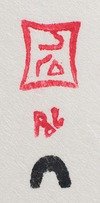
I have only seen this one example used on letterhead. Terry Ryan typed a letter on this stationary on September 23 1963. I assume that RMS means Royal Mail Service but why this chop, which has the igloo emblem at the base and the tailored box much like the early Lucta chops, is a mystery.

Here is an early example of the WBEC emblem or logo printed on letterhead used by Terry Ryan in the 60's. The same yellow was used as the previous chop emblem. I don't think these were printed on the letterpress equipment here but rather as offset lithography.
“It was Sheouak who designed the West Baffin Eskimo Co-op’s abstract symbol, that appears on all the prints produced in Cape Dorset”
— Stange Scenes, Early Cape Dorset Drawings, Blodgett/Gustavison

Blue letterhead for Dorset Fine Arts

Tan letterhead Belmont Street

Wil Hudson's letterhead, Northwest Territories

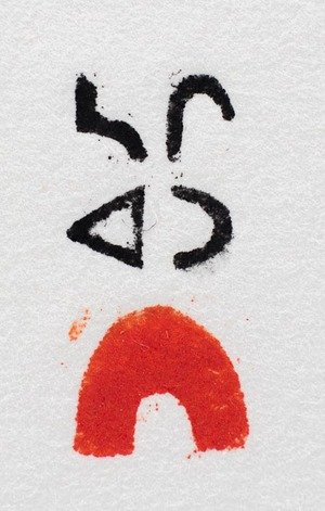
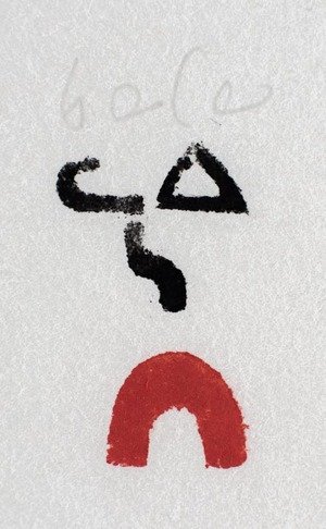
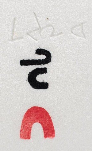
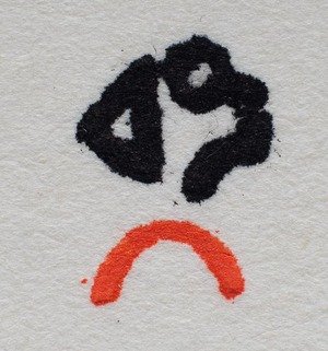
A collection of chops handed down to me by the outgoing Studio Manager Jimmy Manning. These are what's left of the very first chops used on the first 50 years of prints published by Kinngait Studios via Dorset Fie Arts.

Over the past 55 years printers have had to make their own chops to indicate that they printed a particular print. The chop was cut from linoleum often from the floor tiles in the studios. The cut tile is then attached to a piece of wood so the printer can orient the chop properly on the printed impression. In the early days (up to and sometimes including 1974*) artists chops were used instead of their signatures. I assume that the printers themselves would carve the artists chops for the artists because of their abilities with sharp delicate operations. Some artists like Kananginak certainly had the ability to cut his own chops but this is conjecture.
As well as the signature chops there was also the igloo chop. The igloo chop indicates that the impression was printed by Kinngait printers in Cape Dorset or by traveling printers to various events, it is the official indication that the impression was instigated by Kinngait Studios/Dorset Fine Arts.
I am familiar with most prints executed from 1988 until present so I went through the early print archives (1959-1961) to familiarize myself with them, a real treat. In this day and age of corporate and product branding, Kinngait was ahead of the curve. The difference is of course that since people had to make each chop by hand there was a tendency for uniqueness and I want to illustrate that here.

Wallace Brennan 1975. Wally was the Master Printer for the Kinngait studios for a decade, 1974-84.
photo Tessa MacIntosh
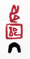
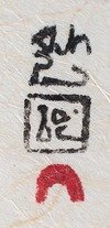
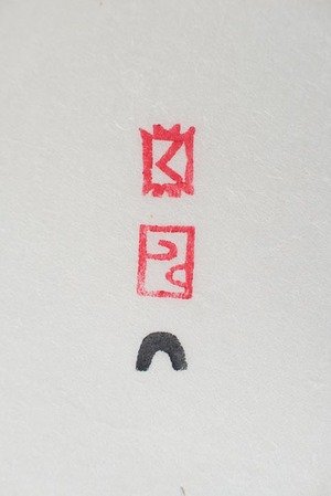
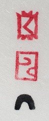
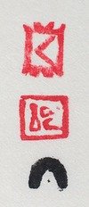
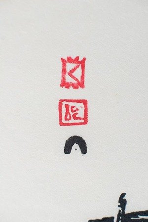
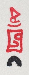
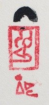
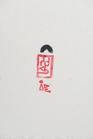
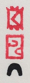
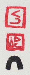
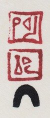
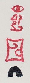
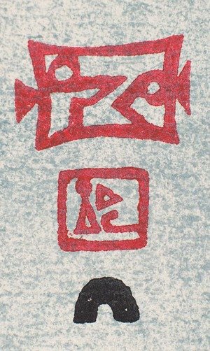
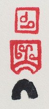
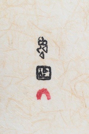
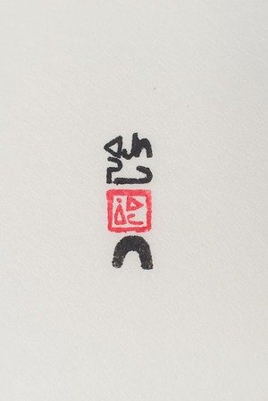
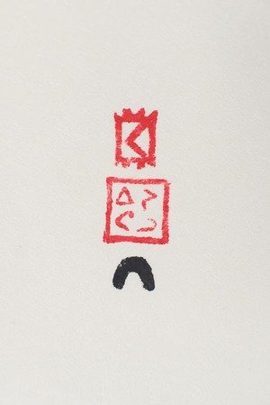
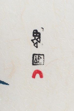
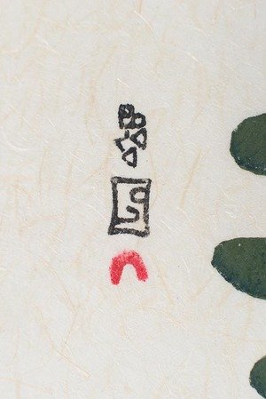
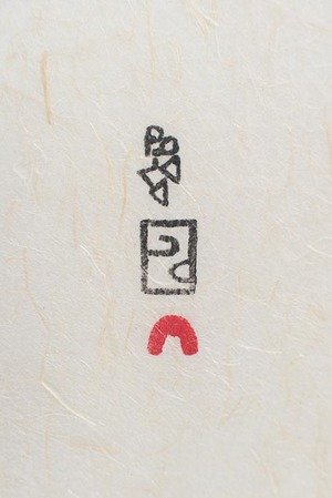
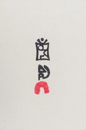
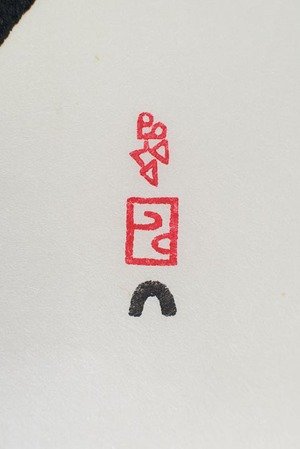
The second last illustration has four chops on the print. The top is the artist Ohotaq Mikkigak, the printers chop Lucta, the igloo chop in black ink and lastly the Eskimo Arts Council chop which reads na ma (soft ka) tu or "good enough". This chop and sometimes a blind stamp were added to the print as a way of authorization by the council to show that this group selected this print edition to be included for sale.
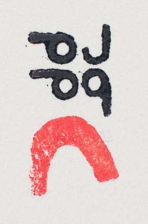
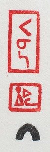
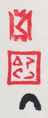
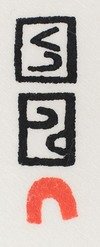
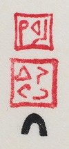
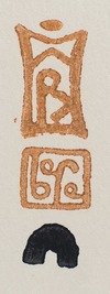
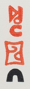
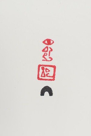
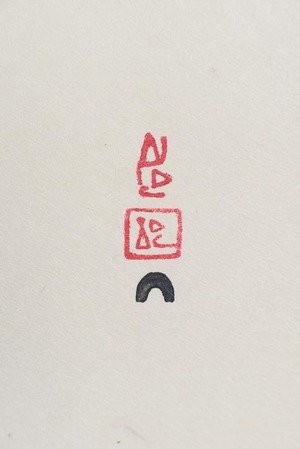
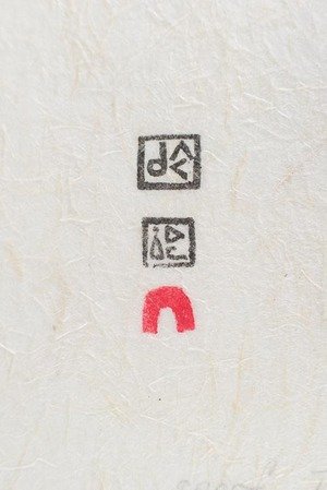
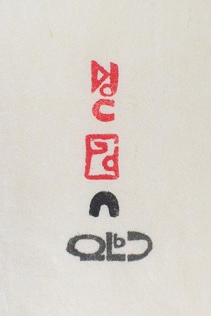
Notice as well the second last line of chop images, the two on the right. The upper chop is the artist Parr. The second chop below that is the printer's chop, Lukta. On the far right example, Kenojuak's chop is on the top, below that is the printers chop Talu. After lots of conversations with Joemee Takpaungai it is thought that this is in fact another version of the printer Lucta's chop. Tulie (also Tuliq/Tulik) was a carver and drawer that was loosing his sight and eventually went blind. In the 1961 catalog there is a chop with Tudlik's name, perhaps this was an artists signature chop and not a printers chop? Later in the same 1961 catalog there is a well known image of Tudlik's, a hunter about to harpoon a seal and his chop is at the top of the stack of other chops, this is the position of the artists signature chop.

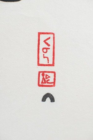
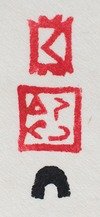
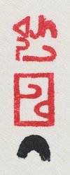
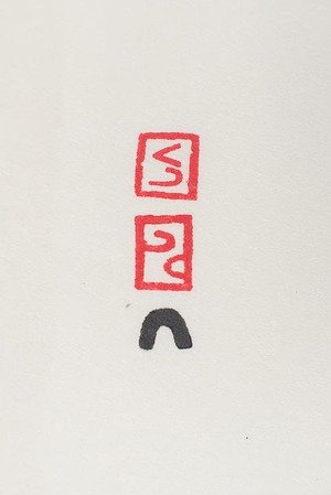
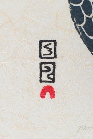
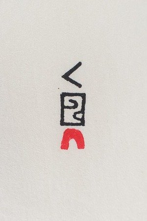
Another example of the inverted Lukta chop. I expect I am seeing these in the archives because they were culled from the edition and not released, as it should be.

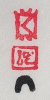
Another example of the Lukta chop inversion. It is fortunate for those of us studying the archives that these impressions still remain here for us to see first hand.

This Kingmeata lithograph has a lot of information. The Eskimo Arts Council blind chop is mid frame, Pitseolak was the printer.
Does anyone out there know who designed the Eskimo Arts Council chop?
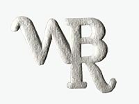
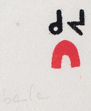
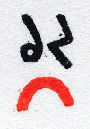
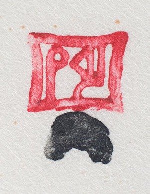
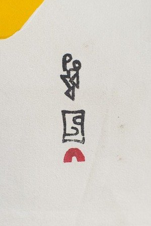
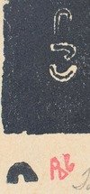
There are other interesting evolutions as well. The WBEC chop shown here.

This "blind" chop appears on all current prints published by Kinngait Studios and Dorset Fine Arts. I have seen very thin versions of this chop well as the above fat WBEC chop. When I find a good reference I will post the thin version for comparison.
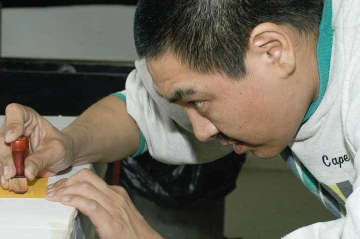
The process of chopping an impression

Mixing the right ink, rolling it out and then rolling the chop into the ink to pick up enough.
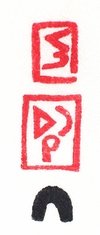
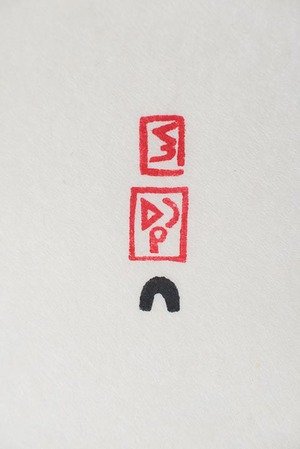
Niviaksie Quvianaquliaq (literally means jumps for joy) applies the store bought igloo chop above the WBEC blind chop on Arnaqau Ashevak's lithograph basket.

Qiatsuq Niviaqsie applies a home made igloo chop beneath his signature chop.I need to ask whether each stone cut printer has their own igloo chop or if they share the same one.

Qiatsuq inking the igloo chop with a small roller

carefully cleaning off the over inked areas before applying his signature chop.