Lead, Antimony and Tin
Type isn't all that easy to come across these days. You can still buy new type from a hand full of dedicated foundries, but still it's hard to come by.
In Cape Dorset, there is a veritable ton of type. I think that's what keeps the building from blowing away in the arctic blizzards we get … the type and the huge machinery spread out over the floor space.
There is a story that Charlie Pachter brought some of the type to Cape Dorset, or at least arranged to have it shipped (conversation with Father Ryan). He was a lithographer from Toronto who came up to Dorset in 1972. Having spoken with Terry again, he said that Charlie only managed to remain in Dorset for 3 days. Apparently Charlie sold a press to Terry, as well as some type, which Wil described as "circus type". Charlie had collaborated with Margaret Atwood to print one of her poems and had designed the type for that project. To my knowledge there is none of this type still in Kinngait Studios, though I would love to see it.


Pied type, but still identifiable.
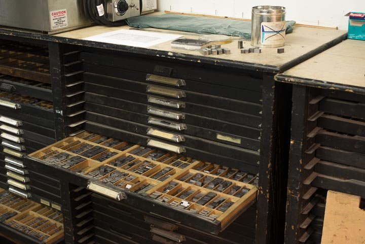
Most of the type is in order. Cases are dirty from neglect, but still enough type to keep anyone happy for some time.
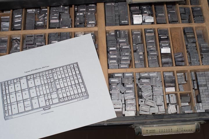
Caslon 337 mmmmmmm good in every size up to 48 pt! (capitals). (337 is the Lanston monotype Caslon, in fact the one that P-22's LTC was based on. )
Richard Kegler, June 19, 2013 email correspondence.

There were four crates like this one with new type never even opened. The packing slip was still inside, as was the sample font in the white envelope.

3 boxes of this kinda thing. Somebody was thinking about casting their own type in Cape Dorset.

420 Dupont Toronto. This is where all that type came from

In this picture you can see the Vandercook 4T and the type drawers along the back wall. Left to right: Aggeak Petaulassie, Simionie Koopapik and Pitsiulak Pinguartuk (identified by Qiatsuq Niviaqsie). Photo: Tessa MacIntosh

Simionie Koopapaik setting type. Simionie also illustrated a printed book with wood cuts. You can see that project in the oost "Other letterpress projects". Photo: Tessa MacIntosh
In the above photo and the one below, behind both Simionie and Pia you can see what looks to be metal type cases. The ones that remain here today are the cases to the right of Simionie. Those four cases hold a lot of type and I expect when Wil left he took those with him and the type stored within.
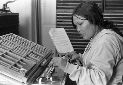
Pia Pootoogook, circa 1973. Photo Tessa MacIntosh.
Spacing Material
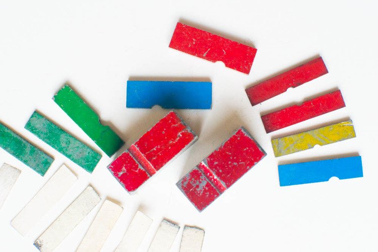
As mentioned previously, Wil painted his spacing material so it would be easily recognizable in the drawer. "Wil said the yellow ones are 5mm; the red are 3-4mm and the non coloured ones are 3mm. Wil concluded with, "yes these are the ones I worked with, I colour coded them"
(email Barbara Aguero May 5 2013)
The lower left are paper spacing material all cut to the exact same size as the other spacing material and stored in the drawers
Another quote from Crispin Elsted of Babarian Press;
“We also bought some type from Wil (upon his return from Dorset), which is still here and is being used. There were supplementary founts of Goudy’s Hadriano, some English Text, and one or two other things, of which the most useful has proven to be two large cases of Bembo and a case of Bembo italic. I’m often reminded of Wil because he had the useful habit of colour-coding his spacing material—for example, in 12pt the “thins” are red, the “mids” yellow, and the “thicks” blue—so that when I come upon coloured spacing his name pops into my head.”
— email Gena Page April 25 2013
In the post about the Kananginak calendar, I wondered where the font Hadriano came from. Obviously Wil had it in Dorset and brought it back to Vancouver.
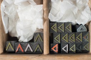
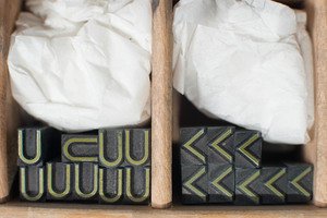
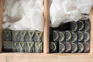
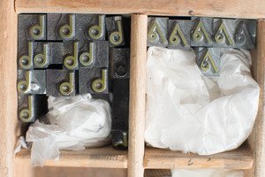
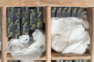
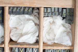
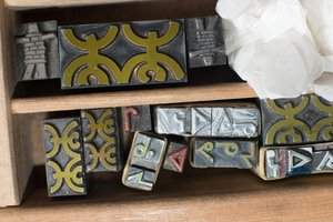
Syllabic type samples
This is a sample of what we have. Each of the characters is limited. Some are caked with ink and/or damaged by attempts to modify them for use as printers' chops. The wadded up archival tissue is to allow the face to be seen without having to remove the sample.